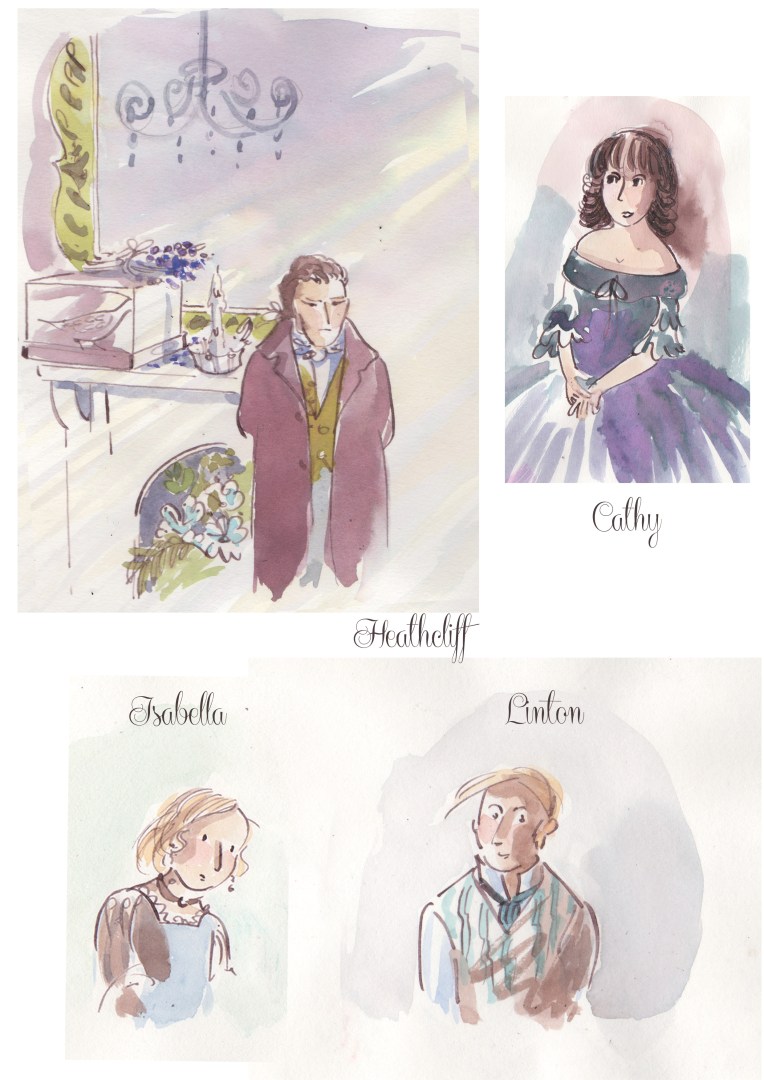
Heathcliff and Cathy are in their early twenties in the pen and ink drawings below. Two major characters from Emily Bronte’s book are Edgar Linton and his sister Isabella Linton. The Pen and Ink style works well for the drama in the book think I will return to this title again.
Here Cathy and Heathcliff share a walk together across the Moorland. To follow on from the previous post to show progression I’ve tried to suggest their ages being between 14 and 15 years old. The birds are a family of Curlews and one startled Red legged Partridge, you may find a dragonfly on a stick and a Cinnabar Moth amongst all that Heather!
Ive used Dr Martins inks and Windsor and Newton inks applied with a brush and a dip pen. The paper was a middleweight cartridge paper which I managed to stretch on a board without tearing.
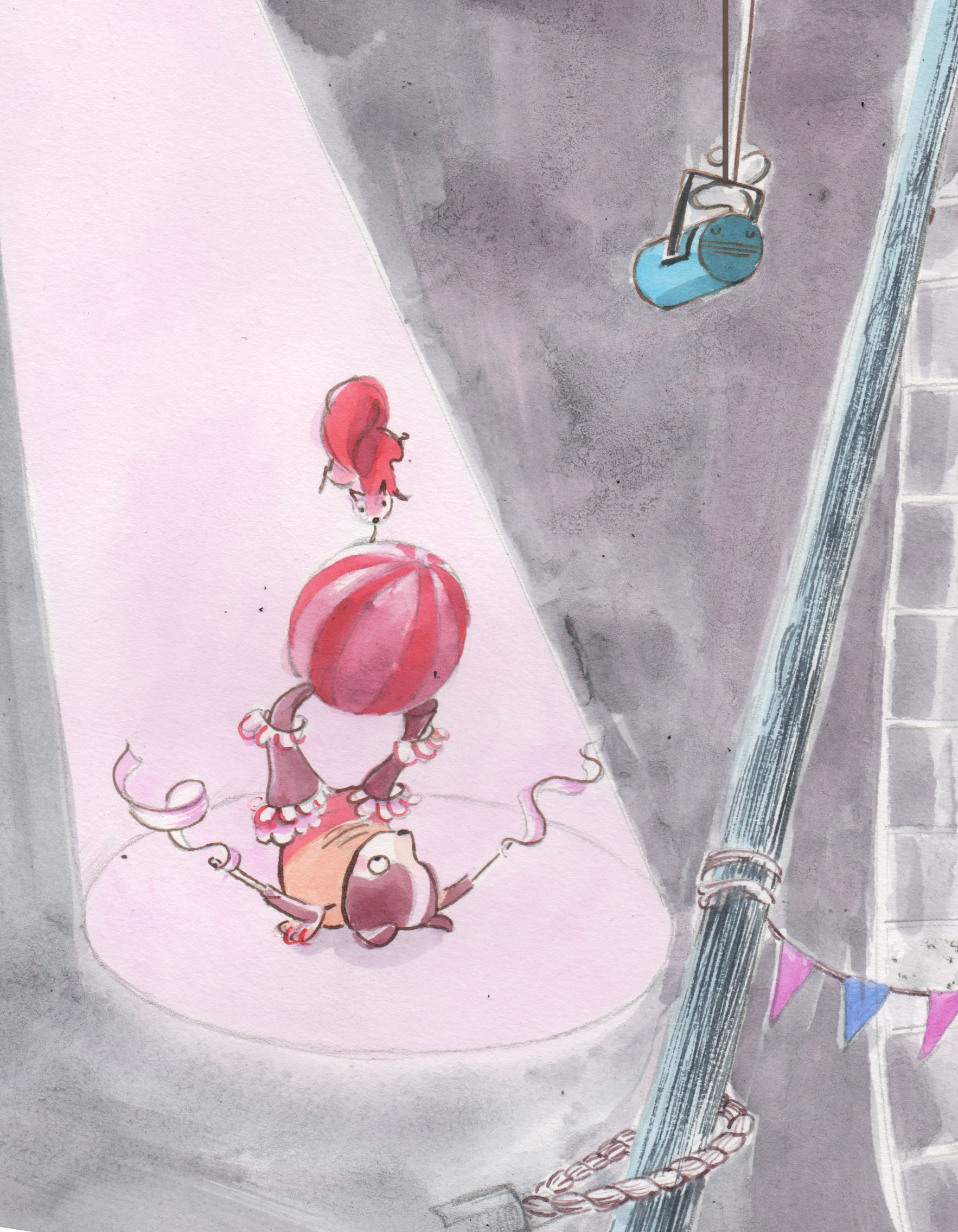
This is the first of three illustrations representing Cathy and Heathcliff from the book Wuthering Heights. I intend to draw the characters next as teenagers. Loved drawing the dogs and mice. Experimenting with paper I settled on cartridge so I could apply ink at the end of the process. Thank you for taking the time to comment over the last couple of years we are all so busy I appreciate it.
The Book thief written by Markus Zusak was a memorable recent read so I thought I would attempt revisiting scenes through drawing Liesel and Rudy. Here I tried to show their friendship and young years.
character development within a story.
Title cover for The Book Thief by Markus Zusak.
Used some strong inks here as I planned for this to be a mock title page. Enjoyed researching details and mixing new shades with Dr Martins inks. FW inks and watercolour. The first illustration was done on bristol board very smooth and white no paper stretching was a big help. The cover above was completed on cartridge paper from a Seawhite sketchbook its not stretched though I hear ironing on the reverse is a possibility! Thank you for looking and sharing my posts it is appreciated.
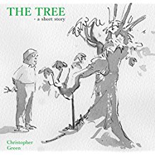
Very happy to have sketched away inspired after reading my brothers latest short stories. Thinking of cover ideas for these two stories set in Japan was so enjoyable as Chris writes so descriptively. Evoking a strong sense of tension and place. They are drawn using indian ink W&N with pen and brush onto very course paper in the same style seen in my recent post The Runner. Both of these enjoyable short stories are available to download. The Prisoner by Chris Green
The neighbor, his wife and their cherished tree face a testing time. The Tree by Chris Green
This rabbit passed me when I was sketching in my allotment it looked at me a while then continued on its way. We met again in the community gardens as I sketched the wonderful wildflowers sown. I think he remembered me!
Soft pastels were chosen here as I wanted to experiment. The second lowest image is A3 in size.
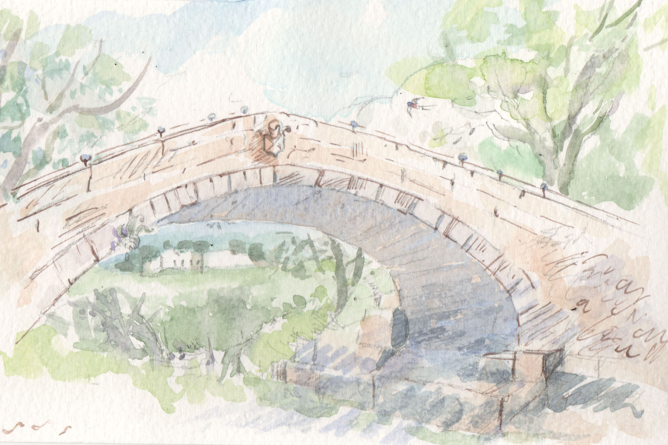
These small postcard entries were for a local gallery at Danby National Park Visitor Centre. Themed on the local area I chose two bridges I love. The artist name is revealed after the exhibition ends in September. I may never see them again so its bittersweet but am looking forward to repainting on a larger scale over winter.
Begger’s Bridge of Glaisdale a romantic spot with plenty of ivy.
Duck bridge originally Danby Castle Bridge which can be seen in the distance.
I did some work for my brother’s short story title, ‘The Runner’. Chris asked for a lovely brush ink effect so I played around with some old chinese brushes and heavy textured paper. My dip ink pen snuck in all the same.


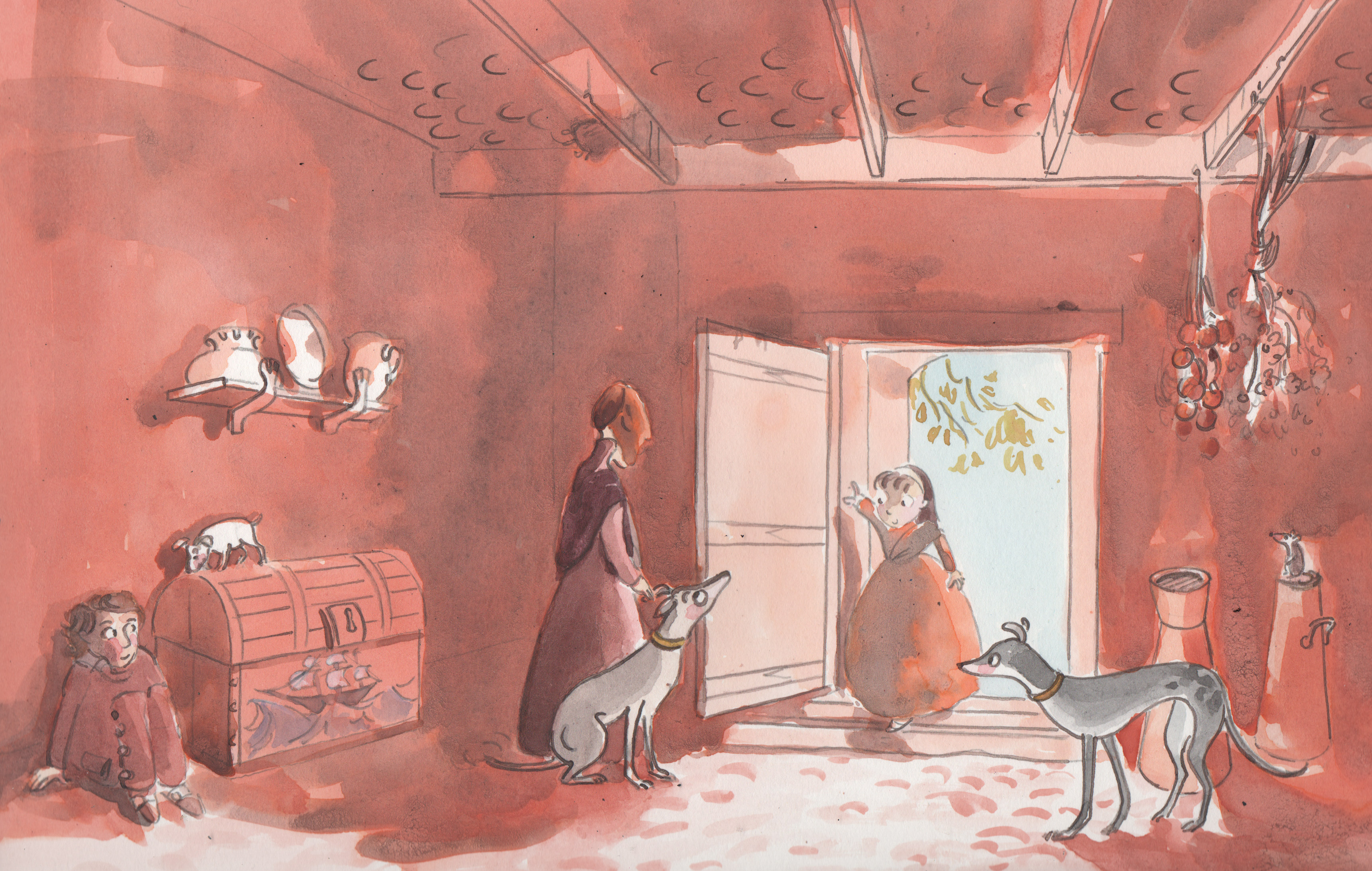 This is the first of three illustrations representing Cathy and Heathcliff from the book Wuthering Heights. I intend to draw the characters next as teenagers. Loved drawing the dogs and mice. Experimenting with paper I settled on cartridge so I could apply ink at the end of the process. Thank you for taking the time to comment over the last couple of years we are all so busy I appreciate it.
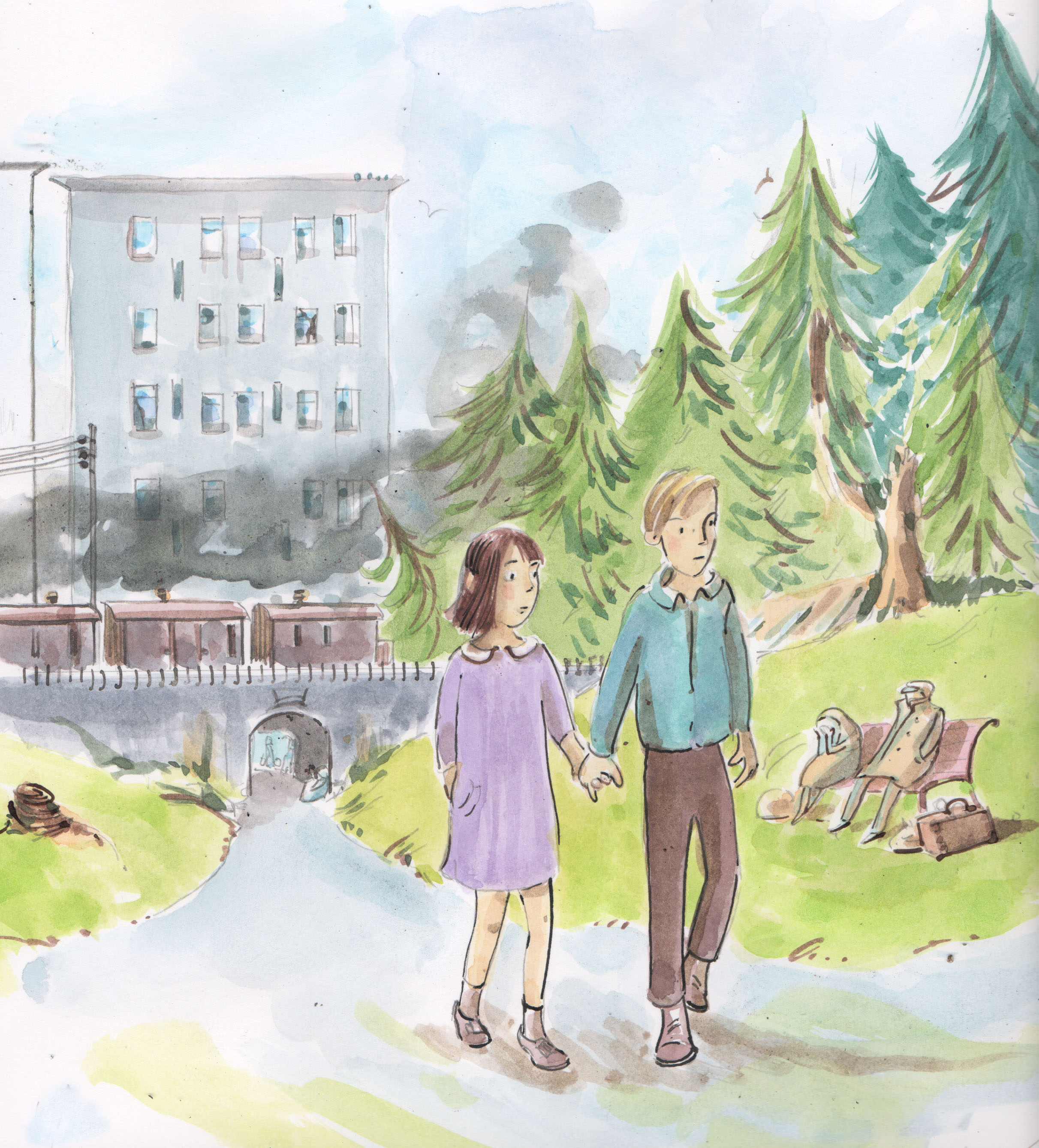


 Very happy to have sketched away inspired after reading my brothers latest short stories. Thinking of cover ideas for these two stories set in Japan was so enjoyable as Chris writes so descriptively. Evoking a strong sense of tension and place. They are drawn using indian ink W&N with pen and brush onto very course paper in the same style seen in my recent post The Runner. Both of these enjoyable short stories are available to download.